UI-Menus
UI MENUS
Most of the RPGs can be considered “menu games”, due to the amount of time spent in those screens, managing the group, shopping, assigning abilities or fighting. It’s come to a point where players don’t even realize it’s part of the basic genre.
For example, the player gets a character, they want to choose an ability, just that action gives the player a few options, and sometimes there are sub abilities. Depending on the game, the player has to choose whether they want to defend or attack. After that, they have to choose which enemy to attack. It’s a few selections, but a lot of variables in only 1 character.
Without noticing, the players spend a lot of time in menus. Without realizing it, players’ first impressions about the game can depend a lot on how visually pleasant the menus are.
Main Menu
Is the first thing a player sees when opening a game. Because of how often we see them, main menus have the tendency to get burned into our brains without us realizing it. The text and sound become too familiar.
For example, it’s easy to know which games are this, or at least a few of them, or there are some soundtracks or sounds that you associate immediately with the game, like the Mario coin sound or the Wii music.
Options of the menu:
- Continue
- New Game
- Settings / Options
- Credits
- Quit
You can make main menus as dynamic as you want. For example: COD black ops has a main menu that is part of the lore.
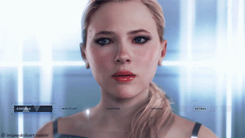
Or Detroit Become Human, where Chloe gets more agitated as the game moves forward. Every time you go to the main menu, there is a different interaction with Chloe, and that makes it very interesting, to want to see what she will say next, or see how her feelings toward you change throughout the game. And how at the end of the game she asks to be set free, and if you accept, she doesn’t appear anymore even if you start a new game.
Character Menu
- Character menu
- Options of the menu:
- Character Selection
- Abilities
- Team Members
- Status / Level
- Weapons
It’s hard to make a character menu, since there is not a general template to start from. Each game has a different character menu.
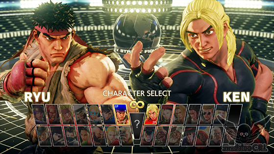
For example, Street Fight 5 only uses less than half of the screen for the menu, the rest is the animation, so the player doesn’t have to drag the mouse through all the screen to see each character.
Valorant also uses this kind of interface, where most of the screen is for the animation. In this case, also using the extra space to show the different abilities of the characters.

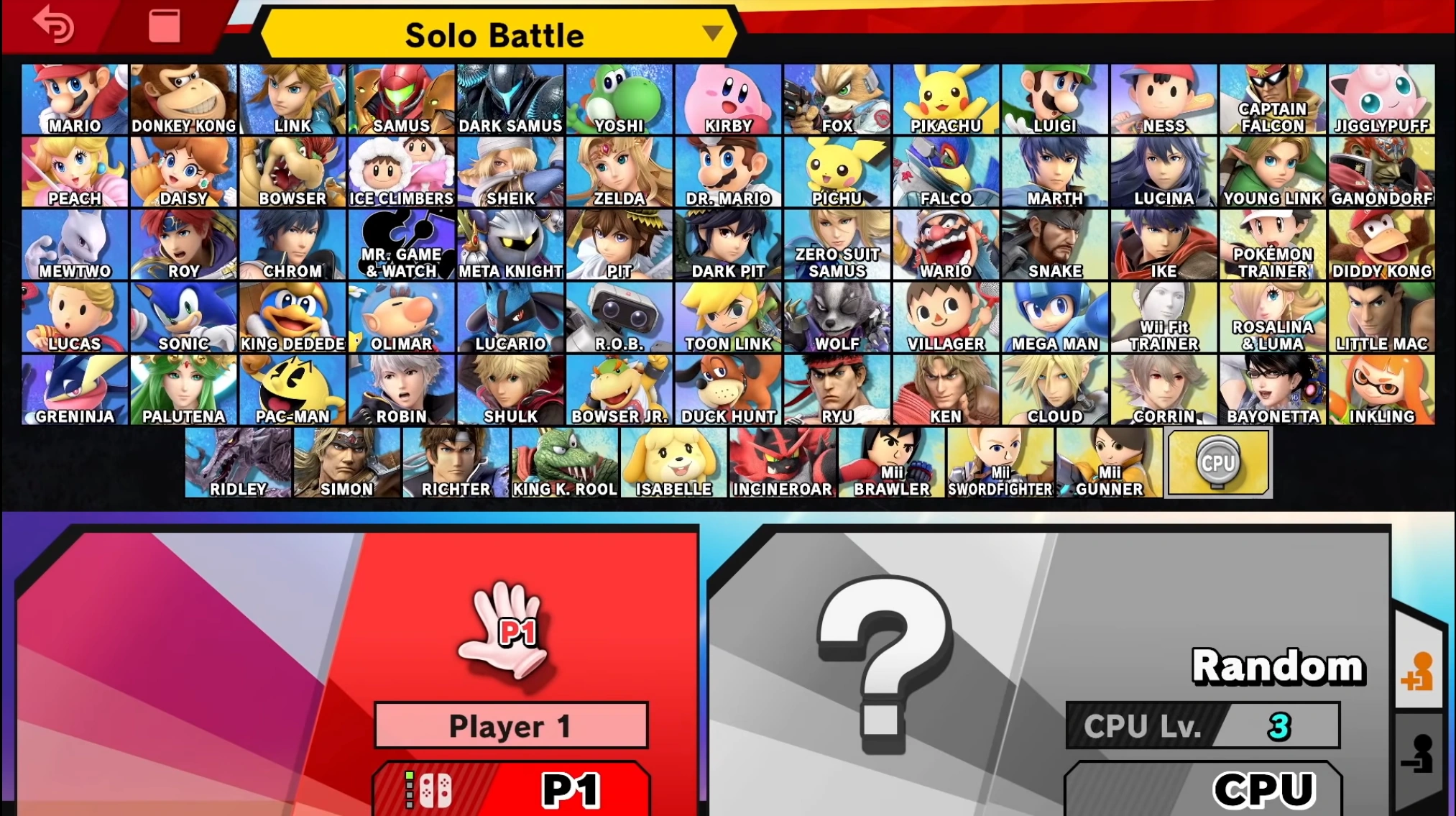
Smash Bros, on the other hand, utilizes most of the screen for the character. This is a good interface for those games with a lot of characters. But the players takes a lot of time just looking through each character (if they don’t know which one to play).
Pause Menu
- Continue
- Settings
- Save Progress
- Party Members
- Main Menu
- Controls
- Quit
Some games have really boring menus, others are too much, like Fable 3, where the pause menu is a room (that you have to wait for it to load) with smaller rooms (that you also have to have for them to load) just to do anything.

Settings
- Options of the menu:
- Controls
- General Settings
- Change everything related to the account
- Volume Settings
- Video Settings
- Change Resolution
- Change Color (for colorblind players)
- Subtitles Management
- Friend Settings (Add, invite, eliminate, chat…)
- Technical Support
- Credits
Options that can be reset: Players are afraid of changing options if they know they can’t go back to the original settings, because they are afraid of changing things and making them worse. So having the option to reset the settings will make them more comfortable changing the controls, or the light or sound of the game to their comfort.
It’s also a lot easier for the player if, for example, they change the controls, but they realize it is a lot messier and confusing than the original settings, to be able to go back to the original ones and start from 0 or stay with those controls.
Quick Menu
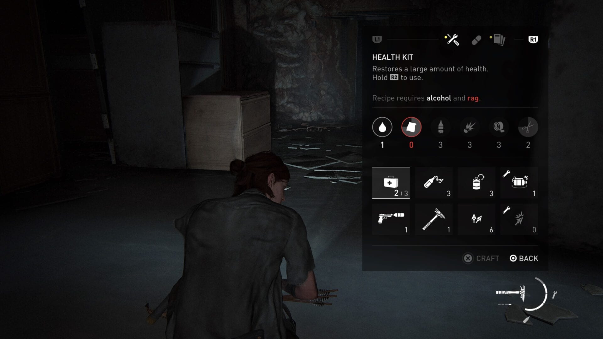
A menu that is displayed during the game, does quick changes, like weapons and abilities. It gives the player many options, very fast. Example: the backpack system in The Last of Us. It’s easy to use and gives you plenty of options, but also gives a layer of strategy, where the player has to plan which weapons will they use and which spot is the best for easier access
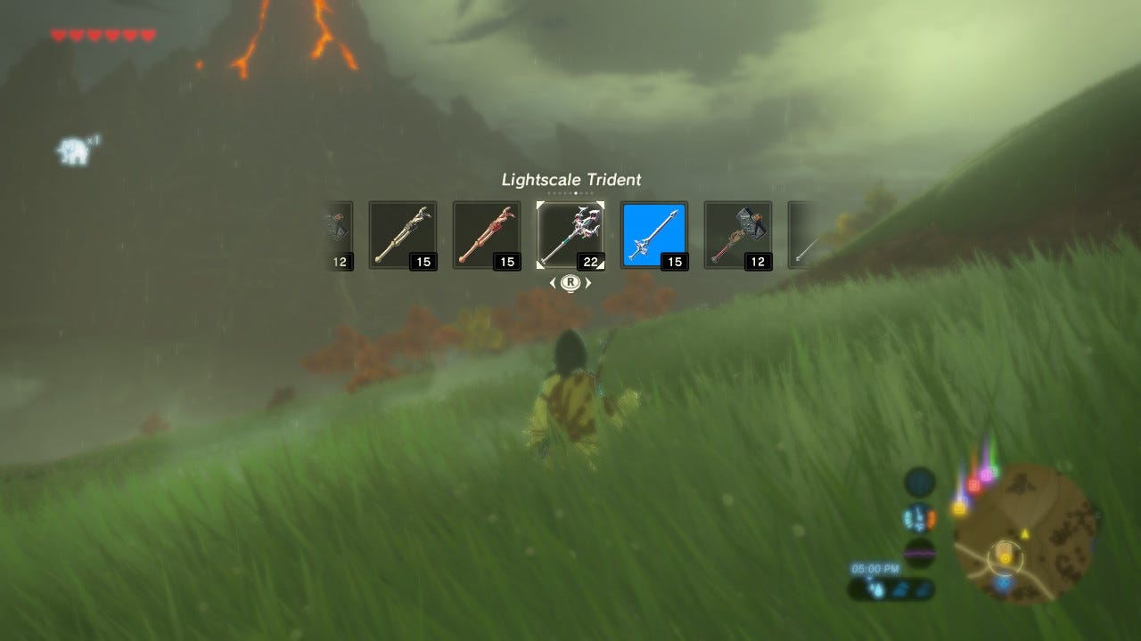
A bad example is Zelda: Breath of the Wild. It takes too much time to get the items you want. Is not too bad, but for a quick menu, it doesn’t really work.
Another example is Zelda: Ocarina of Time, with the Iron Boots. During a part of the game, the player needed to navigate a dungeon with flooded corridors, and to sink to the bottom they needed to have equipped the Iron Boots. The problem came when equipping this item, since it was categorized as equipment, instead of an item like the bow, for example, so the player could not create a quick access to the boots, so the player would need to open the menu too equip the boots, and repeat the steps to take them off every single time, which made it really tedious to go through the dungeon.

Inventory
The inventory menu is one of the most important menus, because of how often the player will be interacting with it. It’s imperative for this type of menu to be easy to use and understand.
Usually, Inventory Menus pause the game when they are displayed. That gives the player the time they need to get organized and plan a strategy.
This is not a rule. For example, Dark Souls and ZombiiU don’t have the pause option when using the inventory, so enemies can still attack the player. That keeps it more immersive and realistic.
Options of the menu:
- Character
- Equipment
- Weapons
- Items
- Status / Level It’s important to have some sort of filter system, to make it easy for the player to search specific items.
Combat Menu Weapons Abilities / powers Enemies Actions
This menu is used in games like Pokemon, or online card games, where the player fights their enemies by selecting different options. This gives the player some time to think and plan their strategy, but it’s important to put some time restraint, to put more pressure.
EXAMPLES
BAD EXAMPLE: Dragon Quest The group management and the individual inventory of each character is a nightmare. That is because each ally will have their own area to save objects that they will have to use effectively in battle.
This gives a planification problem, because the objects they get through the game end up in the inventory of each player, which makes it easy for the players to have their inventories full of “trash” without being able to use the spaces for their battle items. At the same time, team items or objects that they have planned to use in battle can be lost between the inventories of each character, making them look at each one of the inventories to see where it ended up.
It is also an issue with the option of passing everything to a general inventory, because it makes the players look for an item in a huge list without filters or a searcher, and the player ends up at the very end of the list, because usually that’s where the most recent objects end up. This option is a lot more comfortable in other games, where there is a searcher, or some filters that can help you find a specific item, or the most recent objects have some kind of mark to show those are the new ones, and put the useless objects in a certain part so it’s easier for the player to know which objects they can sell or not.
GOOD EXAMPLE: Pokemon This game is a good example of how inventory management can improve a lot. They changed the limited inventory to a bag with multiple inventories, which separated the items by type. It still is a mess for the amount of submenus, but is more specific, unlimited and it’s easier to know where everything is.
BAD EXAMPLE: Metal Max Xeno The problem comes when it’s too specific. Every management aspect is accessed by a specific NPC. There is an NPC to go to the shop, another one to edit the tanks, another one to manage the group and their classes, and each of this options has their own submenus: the one that manages the tanks has an option to create specific parts, and another to improve them, and another to equip them, it also has its own shop. It’s all very specific and organized, but there is a terrible aspect, and it’s that you can’t interact with tanks or characters that have not been added to the combat group, where there can only be 3 characters and vehicles.
Thus, is a nice specific subdivision where every action goes through the same step: take one character or tank out of the group to add a new one. This is also found with the problem of having to take every piece of equipment on them, because otherwise, they become useless. This induces that a simple action of what equipment, motor and possible improvements of each new tank is a nightmare between all the menus, since the player should take out the tank previously used in the combat group, go to the tank management NPC, move around the improvements of the different parts only to see if the new one is better or not, because it’s not possible to compare it directly.
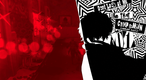
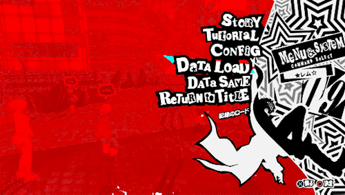
Menus can be a tedious thing for the player. Persona 5 does a great job creating a dynamic menu. Just creating a nice design and animation can make the menus less heavy because of the visual spectacle.
It also helps a lot when the player can program, and redo combat selections, like in Final Fantasy XII or Bravely, reducing or eliminating a lot of the heavy part of walking around the menus. This can be made by creating a button that lets the player play their last action.
Valkyria Chronicles 4 This game also has a lot of submenus, and to make them less heavy, they make animations, which can help, as we saw before. The problem comes when there are constant animations on everything, which makes the whole process a lot slower. Each option has an initial and ending animation. Imagine if you have to do 10 things, and each one of them has an animation. You spend more time watching them than playing the game.
IN CONCLUSION, in RPGs, players spend a lot of time between menus, so we have to take care of them and improve them as much to make them as simple and accessibles as possible.
The objective is to make the menu as easy, quick and simple as possible, but also interesting so the player doesn’t get bored.
HOW TO MAKE YOUR GAME UI SHINE & INCREASE CONVERSIONS
WHY GAME UI MATTERS
As a game developer, our goal is to make the game as accessible as possible. Menus can feel overwhelming, especially in RPGs, that’s why it is important to use the principles of design the right way and measure the impact of the changes.
We want the players to find their way around a game, to even focus on the game. We want them to get the information they need through the interface. No more, no less. Unlike the gameplay, you pretty much always want to simplify navigation as much as you can.
In mobile titles, the interface does not only allow the player to play the game, it can make or break the revenue.
Imagine a shop button in a game. It allows the player to unlock the full game and get virtual money, but if the button is visually unpleasant or hard to see, the player will more likely miss it entirely.
Web designers use this information in order to combine graphic design and analytics to make the most of every element of the applications they build.
Embrace Consistency Consistency is one of the most important keys when we talk about design. You want to apply the same set of rules to your entire interface, or at least whenever is possible. It doesn’t need to be the exact design for everything, but have the same color palette, letter font, shadows and rounded corners, for example.
Defining a precise style guide. If everything looks and works in a similar manner, it will be easier for the player to navigate. Will feel more intuitive. You will be able to reuse designs and it will save time.

Create Visual Hierarchy All buttons should share similar characteristics, but it is important to make the important buttons (the ones the players will use the most) easier to find. That can be done by changing the size, color contrast, more detailed animation or having a unique sound effect.
This doesn’t mean you can change the design of the button. You should try to stay as close as the general design for all the UI.

4 tools to create visual hierarchy Position or layout If multiple elements are aligned horizontally or vertically, they will feel like they have the same importance. If one element is more important, put it in its own row, and that will make it pop more.
Color contrast Use a different main color for the button you want the player to notice. Using a green color is really helpful, since green is associated with something good. Avoid red, or use it in canceling operations and discarting elements from a list. It is the color of blood, so it means danger and can feel more negative.
Size The bigger something is compared to everything around, the easier it is to notice.
Animation An animated cycle in the buttons will get the player’s attention. This should only go to specific buttons to make them pop over the rest of options.
Less is more Having too much on a screen can be a pain for the player. You want them to feel comfortable looking around the interface, so try to avoid too many buttons together, or too much information in one single screen. Take out everything that the player can live without. You can also use submenus, but be careful to not do too many, or it is going to be a mess.
You need some space between the elements. The more space you leave between an element, the more it will pop.
The more options a player has on the screen, the more time it will take them to find what they are looking for, and the more time it will take for them to learn the interface.
Use icons sparingly It is interesting how smartphones brought icons to the table: buttons without labels, that we don’t need to read.
Icons can be confusing. We know that envelope means “read email”, or what the “settings” icon looks like. But we know this because they are used everywhere. How about an option that is not as popular? How do you know people will know what it means? The exclamation mark can mean danger, but at the same time, it can mean there is something you don’t want to miss.
Even if icons can be helpful, you don’t want to use them everywhere. You should use the pictograms(icons) that have an established meaning. We know the play and forward buttons play the level and take us to the next level. These pictograms are also used in music players, making it even more familiar to us, but, for example, in a lot of clothes shops, the basic button is the “buy” label, no icon for it.
If the player doesn’t understand the icon, they will ignore it.
So sometimes, it’s better to use a label, which will give the information of what that button does directly to the player, instead of an icon they might not understand.
Improve User Experience
Let the player know what is happening.


This is an example of a bad experience, since the player doesn’t know if the game is paused due to a bug (the saving label doesn’t have an animation) or connection or if it’s still saving progress.

In this example you can see that there is the wheel (which is animated) and the player can see that it is still saving.

You can do the same with a loading bar.
What the player doesn’t like is when it’s uncertain of what is happening. As we saw with the icons (that the player will not press the button if they don’t know what it is for), not knowing if it’s loading or if it stopped will be frustrating for the player.
Also, making what is selected, more brighter, or in brighter colors. HOVER

Persona 5 menu is a great example of a good menu UX. It has big and easy to read text, and the color scheme is nice, but the best part is the transitions animations, which flow really nicely.
It’s hard to navigate through, with all the different submenus, but just with the art and transition animations it makes it more visually pleasant.
The UI of this game is not good, but the UX is great.
Use objective data It’s easy to make a really good looking interface, but not make it functional.
Analytics are the only way to know for sure your design works and do any changes that will improve the user experience.
Web designers and marketers use the method of A/B testing: Collect data. Measure the conversions on buttons and time the user spends on a given screen on average. Introduce a specific change you want to test. Collect the same data, after you updated the game. Compare the results </p>

Only change 1 variable at a time. This is to know exactly what improves the user experience. But because we may not have a lot of time to only do 1 change at a time, what you can do is change various variables on the same item, for example, change the color, size, sapes, label, etc. of the same button.
BIBLIOGRAPHY
Turn-Based Combat in Unity How to make your game ui shine & increase conversions:
VIDEO: Diseñar menús de juegos: Errores y consejos Interfaces:
VIDEO: So You Wanna Make Games?? Episode 9: User Interface Design:
VIDEO: Diseño UX del inventario - Como Zelda, Resident Evil y Doom hacen grandes menus (UX):
VIDEO: Pixel Art Class - Intro to Game UI: